The sensitive renovation of a historic house can take many directions, and the possibilities are compounded when a wing is added. The act of merging the domestic ideals of two very different eras becomes an exercise in nuance, interpretation, and, hopefully, surprise. That’s the scenario Eric Barth, AIA, Ryan Burke, AIA, and their team at A Parallel Architecture accepted when the new owners of a 1930s Georgian Revival house asked for a renovation and addition. Located in West Austin close to downtown, it is part of a neighborhood consisting of early-20th-century-style mansions on large lots.
Classical architecture is not in the firm’s oeuvre—both partners live in Midcentury Modern homes, and their portfolio is built on Texas Modern–style houses with right angles and rectilinear motifs. But the firm’s philosophy that “buildings are beholden to their site, whether physically, climatically, or contextually,” provided an appropriate framework for thinking about how to deliver their clients’ wishes. The owners, a family with children, hired them to do a feasibility study after purchasing the property for its location, generous lot, and neighborhood feel. “They said, ‘It has a historic house that we don’t really like; what can you do,’” recalls Eric. “Rather than drastically change the house, we explored what it would mean to save, enhance, and restore and make it more interesting than if we tore it down and built something modern.”
Not that tearing down was an option. Austin’s historic preservation office required the historic part of the house to be preserved, while allowing some creative freedom. Behind its symmetrical red-brick Georgian façade, the building was L-shaped with a one-story wing off the back that was thought to be original but lacked architectural value. Thus, while the L-footprint was maintained and then expanded with a modern appendage facing the street, the symmetrical main part of the house was dismantled and rebuilt by cataloging and reusing the materials. The existing wing, by contrast, was completely reimagined.
“We took the main part of the house seriously as a historic restoration,” Eric says. “That was the fun part; we got to do a deep dive into historic restoration and design things like fluted columns and porticos that we don’t usually get to do, and then design a modern addition. It’s a tale of two cities.”
Winging It
Indeed, marrying the modern addition with the symmetrical elegance of the main house posed conceptual, structural, and material challenges. Chief among the structural hurdles was the discovery of unstable clay beneath the poorly built basement. That required gutting the house to its framing, jacking it up, and constructing a system of concrete piers and rebar about 30 inches deep. With the basement removed, a French drain and redundant pump system were installed to keep the crawl space dry. “It was like open-heart surgery, but then the center mass was structurally sound and ready to be put back together,” says builder Matt Shoberg. To meet the second-story finished floor level in the historic part of the house, the addition’s floor system was constructed with 12-inch-deep trusses hung from deep steel beams upturned into the walls. “Normally you’d have a 24-inch floor truss to run mechanicals; we had to cram them into a tight package,” he says.
During the restoration of the Georgian façade, the Austin Commons brick was pulled off and stripped of its bright red paint. It had been quarried in downtown Austin where a golf course now stands, and the intention was to leave the brick unpainted. However, a shortage of salvageable material led to infilling with brick that matched the proportions and color, and covering everything with a limewash slurry. “It has a more nuanced and subtle texture than paint, earthy and more akin to the original look we were going for,” Eric says. What’s more, the light-colored, east-facing façade emphasizes the historic structure’s detailing and symmetry and sets it apart from the dark-colored addition.
From the street, the addition reads as a two-story cube attached to the south side of the old house. Its black Richlite rainscreen, made of recycled paper, helps it recede visually. “The original concept was for bronze panels, but the client wanted to do something more eco-conscious,” Eric says. Between the two buildings, a glass void unmistakably marks the separation of old and new. “We connected the two with a glass bridge, or reveal, that allows you to immediately understand and appreciate the original building footprint,” Eric says. “On the first floor it’s a full-height window into a bar area that stacks below the bridge. When you’re standing in front of the house, you can see right between the two buildings.”
The Georgian architecture’s brickwork wraps a one-story mudroom/laundry extension on the far side of the cube, as well as the renovated wing on the northwest. This created a cohesive rear view, along with continuous steel trellises that shade the west-facing glass and draw a horizontal datum line across the back. There, too, the addition’s second floor is stepped back to create an airy elevation facing the pool.
Inside, the Georgian house’s thickened walls and formal proportions pair seamlessly with an organic plan that shifts the focus to the outdoors with glass walls, deep overhangs, and blurred thresholds. In the central foyer, an unsalvageable winding wood stair was replaced in the same spirit with a sweeping plaster stair—a minimalist, free-floating helix. In the dining room to the south—originally the living room—some of the windows were enlarged as portals to the addition and grounds.
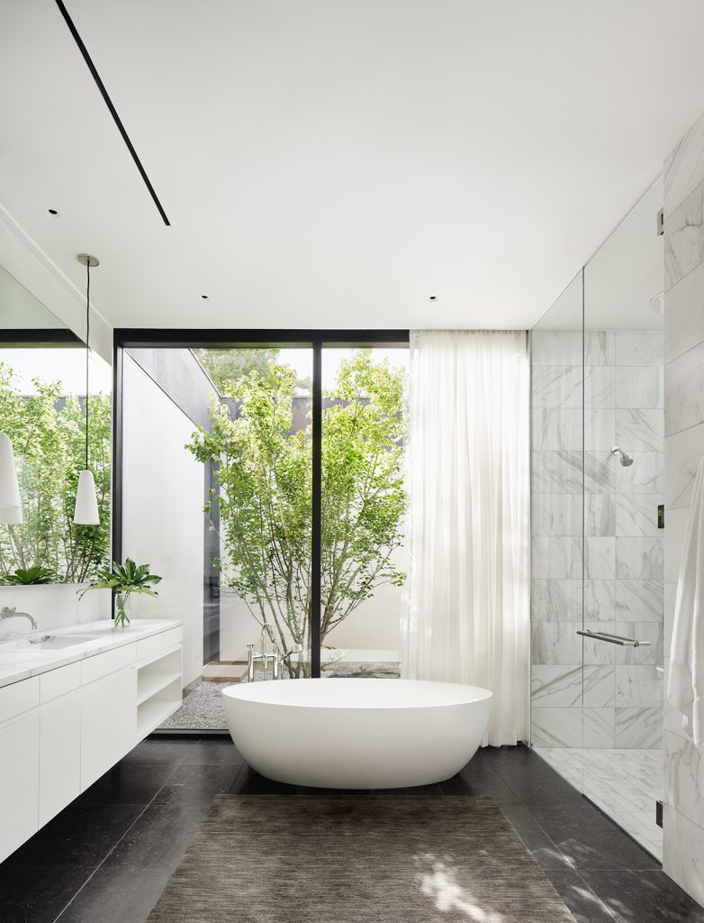
To the north, the old dining room became a library that pivots to the perpendicular wing, which formerly contained the kitchen and other disorganized spaces. Now it houses offices for the owner and an assistant, along with an expansive primary suite including a meditation room that gazes into a pocket Zen garden. “The foyer and library are transition zones that allow the assistant to come to work without traversing through family life,” Eric says. Upstairs in the central part of the house are a music room, playroom, office, and bedroom, with an additional two bedrooms in the addition. Downstairs, the addition contains an open-plan kitchen and family room that flow out to the pool terrace, supplying the informal living spaces that were missing in the original house.


House Blend
Subtle, articulated detailing and textures unite old and new. “Viewed from the exterior, we wanted to celebrate the old part of the house, but we didn’t want it to be such a slap in the face inside,” Eric says. It was a fine line to walk. Moldings and hardware were among the elements the architects sought to preserve. “The trim was scattershot,” he says. “We picked the room we thought had done the best job of it and carried it through the old part of the house.” New single-hung windows were replicated with the historic divided light patterns and proportions, and a creamy paint color ties together the interiors.
The foyer’s helical stair has a steel skeleton whose railing and walls were hand-troweled with marble plaster on site. “We had several rounds of fine-tuning,” Eric says. “The trick about plasterwork is you don’t want it to look perfect and machine-made, but you don’t want it to be lumpy. There’s a sweet spot of beautiful imperfection, and everyone on the team had to agree on the best version.” Floors are white oak, and the ebonized oak kitchen cabinets balance the light-colored brick and other finishes.
In the library, an Egyptian table, symmetrical shelving, and carved fireplace frame uphold and update the original home’s classical symmetry, as do brick pilasters in lieu of a glass wall system in the addition’s family room. In the owners’ suite, the meditation room’s exposed oak beams were inspired by their visits to Japan. Its ipe decking continues out to the garden through a wall-height sliding door. And their bedroom, with its cozy window seat, opens to the pool.
A Parallel Architecture takes its name from the intent to “approach architecture, interiors, and landscape design in parallel,” they write. This project exemplifies that strategy particularly outdoors, in collaboration with Ten Eyck Landscape Architects. A new three-car garage and guest suite on the property’s southwest edge encloses a rear courtyard that serves as a hub for entertaining and outdoor activity. Defined by a low, board-formed concrete wall and a fireplace, a patio on the south side segues to a gravel dining terrace under a bosque of trees in the front yard. Only partially hidden by the property’s front wall and fencing, it is meant as a neighborly gesture.
“We did a lot of transparency studies to find the right amount of connectivity to have a conversation through or over the fence,” Eric says. “Thirty percent is solid, which corresponds to the old part of the house; the rest is very open. The front yard has a big picnic table like you might find in the Italian countryside under a grove of sycamores. It’s something the clients really wanted after their time in southern Europe, and the gravel fits in with the arid Texas landscape.”
Echoing the house’s original materials, the front wall and entry path are made with salvaged, unfinished Austin Commons brick blended with proportional replacements.
In its outward appearance, the distinction between old and new is quite clear but in a mutually respectful way. Inside, however, the differences seem almost to disappear, registering only as sympatico points of interest. “You could easily walk through and not know you’re standing in two radically different eras,” Eric says, underscoring the transformative association of past and present.


West Lynn Residence
Austin, Texas
Project Credits
Architect: Eric Barth, AIA, and Ryan Burke, AIA, principals in charge; Diane Hong, project architect; Michael Battjes, project designer, A Parallel Architecture, Austin, Texas
Builder: Matthew Shoberg, Shoberg Homes, West Lake Hills, Texas
Interior designer: Ten Plus Three, Dallas
Landscape architect: Ten Eyck Landscape Architects, Austin
Structural engineer: MJ Structures, Austin
Geotechnical engineer: Capital Geotechnical Services, Austin
HVAC consultant: Fresh Air HVAC Sizing, Austin
Lighting designer: Studio Lumina, San Antonio, Texas
Project size: 8,290 square feet
Site size: 0.75 acre
Construction cost: Withheld
Photography: Casey Dunn
Key Products
Cabinetry: White oak, walnut
Cooking ventilation: Wolf
Cooktop/oven: Miele
Countertops: Calacatta, quartzite, Carrara, Ann Sacks
Cladding: Richlite, reclaimed brick
Decking: Ipe
Dishwasher: Miele
Entry doors: African mahogany
Faucets: Rocky Mountain Hardware, Watermark
Flooring: Engineered European white oak
Hardware: Rocky Mountain Hardware
Humidity control: Ultra-Aire 98H
HVAC system: Mitsubishi
Lighting: Bocci, Visual Comfort & Co., Jonathan Browning
Millwork: Buda Woodworks
Outdoor grill: Fire Magic Grills, Regal
Outdoor kitchen cabinet: Danver stainless steel
Outdoor refrigerator: Summit
Outdoor vent hood: Sirius
Paints: Benjamin Moore, Farrow & Ball
Passage doors/hardware: House of Antique Hardware, Emtek
Paving: Leuders limestone, reclaimed brick, granite Euro cobble
Refrigerator: Sub-Zero
Roofing: Ecostar Synthetic Slate (existing), TPO with river rock ballast
Shading: Drophouse Design custom steel louvers
Sinks: Blanco, Lacava
Skylights: VELUX
Soffit sheathing: DensGlass
Specialty appliances: Miele
Structural steel: Drophouse Design
Toilets: TOTO
Tub: ADM Bathroom, Kohler
Ventilation: Panasonic WhisperLine
Washer/dryer: LG
Window shading systems: Lutron
Windows: Durango, Quantum Windows, Windsor clad (historic)
Wine refrigerator: Sub-Zero


