

Just before the new Walker Art Center opened in Minneapolis in 1971, Louise Walker McCannel, the granddaughter of founder Thomas Barlow Walker, commissioned the design of her own house nearby. Trained in the arts, she had curated and cataloged her grandfather’s art collection and was on the board of the Walker Art Center when Edward Larrabee Barnes was designing the museum building. And although she worked with local architect Thomas Horty on her own house, it borrows some ideas from the Brutalist art center, owing, no doubt, to the concurrent commissions.
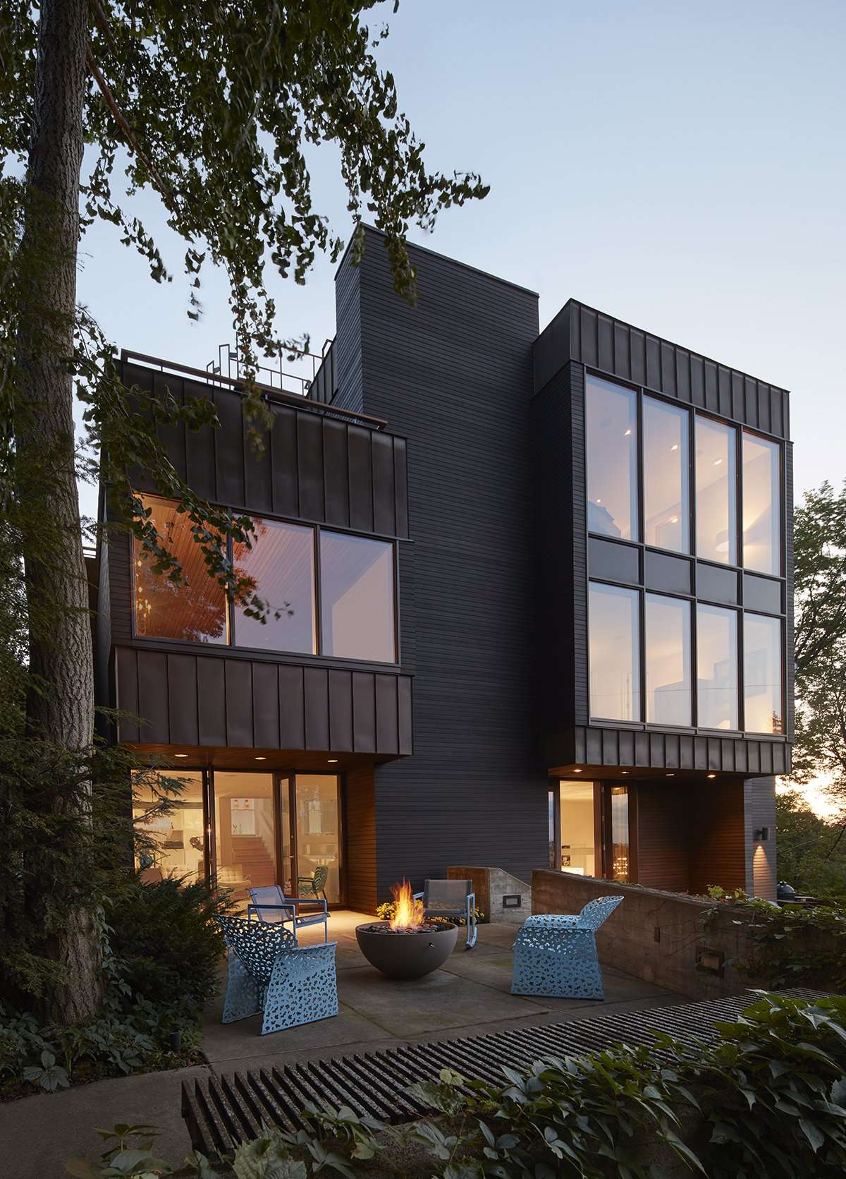
Perched on a bluff and completed in 1969, the 5,900-square-foot house too was designed in the Brutalist style, with strong massing and geometries, concrete retaining walls that wrap it, and a garage embedded in the hill. Like the Walker Art Center’s circular stair and outdoor galleries on the upper level, the house’s defining feature is an “architectural double helix” of inside and outside spaces. A spiraling stair winds around a glass elevator core, with breakouts to a lawn and outdoor decks as you move up through three stories. The crowning touch is a party room at the top, and above that a roof deck with a stunning view of the city.
As is often the case for art patrons, the home was designed to host lively events. Louise “was a philanthropist who entertained, and her husband was an ophthalmologist. It was a wacky house that was personal to this couple,” says VJAA partner Jennifer Yoos, FAIA, whose firm the new owners hired to renovate it over a 10-year period. “They collected early electronic art, and there was a band platform where musicians played; the music would come down around the circulation core.” The client couple discovered the house when they attended an estate sale of its contents. They too are interested in art and philanthropy and imagined using the residence in similar ways.
However, as conceptually sound as Horty’s design was, there were “a lot of fails on the interior,” says VJAA partner Vincent James, FAIA. While some of the awkwardness came from 1980s interventions by another architect—random walls that blocked outdoor views, ungainly porches added—even the original plan had lost its plot. “There’s a mystery there,” Vincent says.
The architects speculate that Horty started the project and turned it over to a junior architect, perhaps because the client was making changes he wasn’t happy with. Whatever the case, “in the original design the rooms were compartmentalized, but later additions furthered the problem with indoor porches so you couldn’t see out,” Jennifer says.
Born in Hungary, Thomas Horty came to the U.S. in 1936, studied under Eero Saarinen at Cranbrook Academy of Art, and later established his firm, Horty Elving and Associates, as a leader in hospital architecture. “Thomas Horty was capable of quite good modernist work,” Vincent says. “The bones of this house are so solid that it could survive all the modifications and be brought back to life with good clients. It was an important moment when the current owners walked in and said, ‘We’re going to do something with it.’”
Restoring the Plot
The rehabilitation’s big gestures centered on restoring daylight connections to the exterior in the living spaces and creating a more generous flow among them. In the process of nearly gutting the bi-level main living areas, the architects removed a mirrored wall separating the kitchen and dining room but preserved a key feature—a cocoon-like conversation nook that circles around a fireplace.
A few steps up in the original living room, a movable partition and powder room had been added to turn it into a bedroom, along with an enclosed, curved porch that further severed the daylight connections. The architects removed those elements along with two other porches that had been added in the 1980s—one outside the dining room and a smaller one off the kitchen.
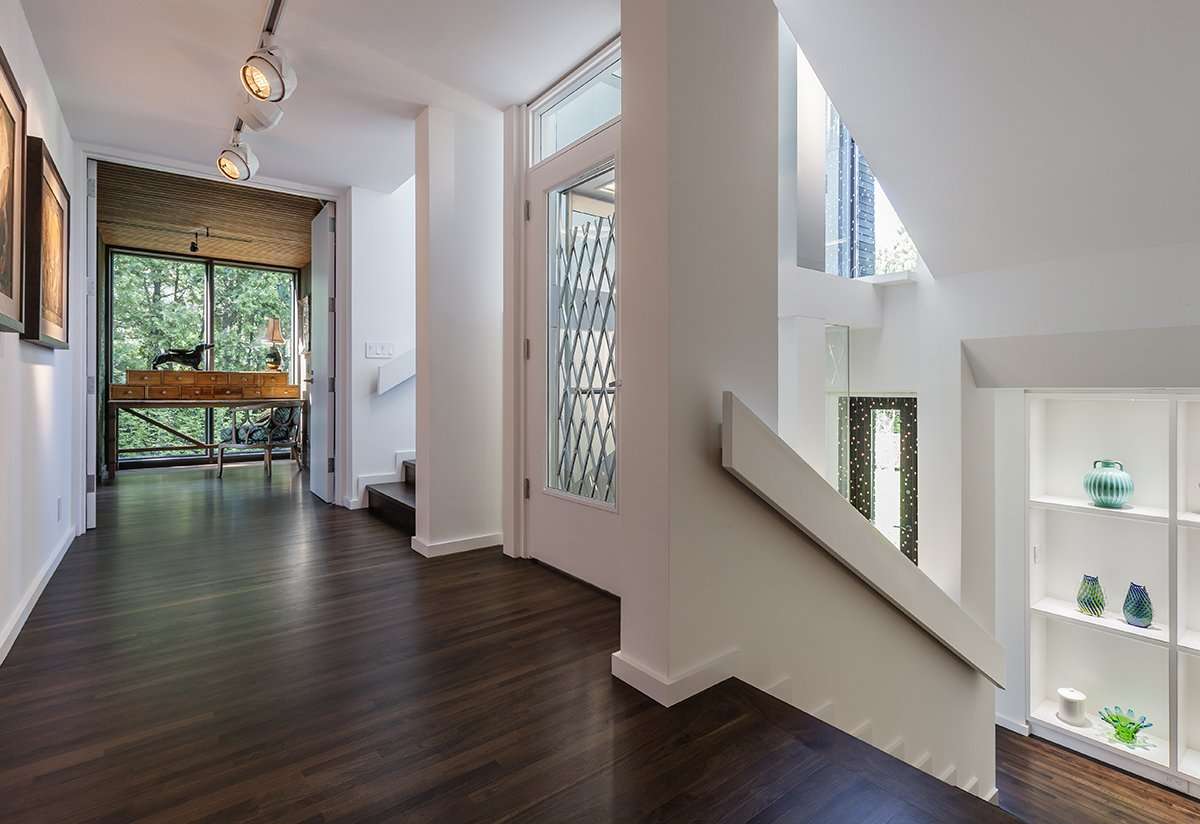
They widened the stairs to the living room by reorienting the elevator door and added custom display shelving in the kitchen and stair hall for the clients’ collection of glass, porcelain, and ceramic art. These moves created an airiness that draws you out to the original east-side concrete terraces—one outside the dining area and another outside the living room—and up through the house.
In the entry hall, a period art installation also ushers the past into the present. Hanging along the entire glass elevator shaft, this curtain of twinkling lights was an important part of the original entry experience. The architects helped to track down the artist, who restored it. “The original owner had some really unusual light fixtures from the 1960s and ’70s that the clients kept,” Jennifer says. “They found other pieces to work with those.”
Only minor floor plan changes were needed on the two-bedroom second level. The architects redesigned the primary bath, connected the den to the main bedroom, and added all-new finishes and millwork. The primary suite—bath, sauna, bedroom, sitting room for late-night reading, and south deck—now occupies the entire east side of the house. On the west side is a bedroom for the couple’s college-age son and a generous stair landing where double doors lead out to a grass-covered roof atop the garage and guest suite.
Upstairs, the spectacular party room received a few clarifying modifications. There the architects added a powder room and removed a band platform above the stairs to create a two-story space for art display and bring daylight down through the stairwell. Glamorously fitted out in vibrant blues and greens that echo the color scheme throughout the house, the party room has floor-to-ceiling windows and a sweeping, northwest-facing deck from which to fully appreciate the million-dollar view.
“You ascend to a big surprise—a grand view of Minneapolis,” Vincent says. “The house releases you as you look out on the landscape. It’s the punchline; the Walker Art Center has a similar kind of experience.”
Cold Versus Crafted
In addition to opening the constricted rooms, another key part of the renovation was to refine the details and finishes in keeping with the house’s pedigree. They are an appealing counterpoint to the austerity that characterizes Brutalist architecture. “That’s when Brutalism really shines, when you combine it with details that are crafted and add visual complexity,” Vincent says.
The original detailing, common to that era of construction, included finishes like shag carpet and mirrored plexiglass surfaces. The architects added richness with new walnut kitchen cabinets and walnut flooring throughout the house. To simplify, brighten, and unify the spaces, the original woodwork was painted, along with acrylic surfaces, railings, and baseboards. Inspired by the metal purses the clients collect, the architects also designed a sliding metal-mesh curtain between the kitchen and dining room. And a skim of plaster over the original Sheetrock added durability and a sense of handcraft. “We did a lot of things that were about sensualness, making things minimal and discreet so the house felt much more open and light and airy,” Jennifer says.
With their unerring eye, the clients were an integral part of the design team. “The current owners are incredible curators,” Vincent says. “Their choice of accoutrements to add to the house were always dead on, sophisticated, surprising, and humorous. The objects are true to the spirit of the house and take it to the next step. They were looking for period pieces but upholstering them with new and interesting fabrics.”
To their credit, they chose to keep the eccentric cast iron “eyeball” fireplaces that hung on cantilevered columns in the primary bedroom and den (perhaps a wink to the resident ophthalmologist). The owners also appreciated that each old bathroom had its own distinctive flair. They amped up that spirit, collecting one-of-a-kind period light fixtures and working with a local interior designer to choose decorative tile and wallpapers that complement the character of each fixture and the house’s 1960s legacy.
That sense of craft extends to the exterior. Builder Bruce Yerigan’s crew replaced the worn-out cedar siding with dark-stained cedar while preserving the vertical copper panels that define some of the massings. Before the house sale was finalized, all the siding had been removed during a forensics study to make sure the walls were holding up. The crew reattached the cedar and copper on the existing rainscreen system. In the process they incorporated a copper detail VJAA designed that ties into the window system, helping to seal the mitered corners while creating a more polished look.
“The walls under there were in good condition because of the air space between the building and the siding,” Bruce says. In contrast, the cedar decks on the bedroom and party room levels were quite rotted, he adds. “We took those off and put an ipe paver system on pedestals in place of that.” Copper fascia on the inside of the parapet walls was removed and reinstalled on top of a waterproofing membrane. And a new bespoke steel railing and wood cap raised the deck walls above the original 30 inches, drawing a refined line that carries the interior sophistication outside. “The railing is a crown on top of the Brutalism, this delicate line that’s the pinnacle,” Vincent says.
But the final grace note is the roof perch reached by a spiral stair on the party room’s smaller south deck. Formerly consisting of a palette-like floor with a 6-inch curb and no rail, it now has built-in benches and an elegant steel railing that nearly disappears against the landscape and sky. “We built a steel structure offsite to support the railings and decking,” Bruce says, “and flew it onto the roof with a crane in two pieces to limit work on the roof itself. The structure sits back from the roof edge, and the handrails were attached to the steel structure. The built-in benches are part of the handrail system.”
There’s a lot of history woven into this project. For example, the design of a fence bordering the rooftop lawn reinterprets a fence rescued from downtown Minneapolis’ Guthrie Theater. Designed by Ralph Rapson, the theater was demolished to make way for the Walker Art Center’s Herzog & de Meuron-designed expansion and greenspace in 2005. The clients had collected the original fence, which they placed on another part of the property.
“The beauty of the original fence was the thinness and delicacy of the boards,” Jennifer says. “In a nod to Rapson, we developed a set of details around the vocabulary, adding a steel frame.” One section of the fence forms a guardrail where the lawn drops off to a pocket courtyard carved into a slope outside the subterranean guest quarters. The new suite occupies former storage space behind the garage, with board-formed concrete retaining walls and a Cor-Ten steel panel enclosing a private, light-filled garden.
In a house where many of the objects speak to its origin story, “the magic is in the sequence of beautiful spaces connecting the interior to the exterior—some intimate and some dramatic,” Jennifer says, adding, “The clients were committed to respecting, preserving, and continuing Minneapolis’ artistic history. They’ve taken on the spirit of the house in a very new way.”


Waverly Place
Minneapolis
Project Credits
Architect: Jennifer Yoos, FAIA; and Vincent James, FAIA, design principals; Nathan Knutson, FAIA, managing principal; Nicolas Allinder, Dzenita Hadziomerovic, Emma Huckett, Karen Lu, AIA, Nate Steuerwald, AIA, project team, VJAA, Minneapolis
Builders: Yergin Construction, Minneapolis (exterior renovation); Crawford, Merze Construction, Minneapolis (interior renovation)
Interior design: Walsh Design Group, Minneapolis
Landscape design: Damon Farber Landscape Architects, Minneapolis
Structural engineers: VAA, Plymouth, Minnesota; MBJ, Minneapolis
Envelope consultant: Building Knowledge
Project size: 5,900 square feet
Site size: 0.4 acre
Construction cost: Withheld
Photography: Paul Crosby; © Steve Hall, Hall + Merrick + McCaugherty
Key Products
Cabinetry: J.D. Woodcraft
Copper restoration: KCI Conservation
Countertops: Twin City Tile and Marble
Decking: Bison Innovative Products
Flooring: Walnut by Belrose
HVAC: Modern Heating & AC
Kitchen chainmail scrim: MailleTec Industries
Kitchen ladder: Bartells
Kitchen sink: Julien
Lighting/Lighting Controls: Lutron
Paints/stains: Benjamin Moore, Cabot Stains
Range: Viking
Roofing: Mule-Hide EPDM membrane
Siding: Western red cedar
Toilets: TOTO
Tub: Wet Style